Analytics / Field note
Operational reports should explain themselves
A report is useful when a reader can understand what a row represents and where its information came from.
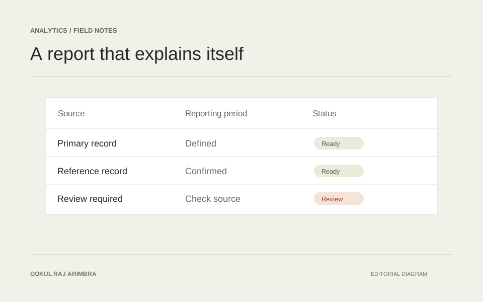
A report is useful when a reader can understand what a row represents and where its information came from. The visual design should support that understanding before it tries to make the report look impressive.
Define the row
Explain whether a row describes an item, an order, an adjustment or a period. Keep different kinds of records distinguishable. Ambiguity here creates problems that a polished chart cannot solve.
Keep context close
Show the status, relevant date and source reference beside the information they explain. Use consistent language for pending, reviewed and completed states. Where an adjustment affects another record, make the relationship traceable.
Design for questions
Think about what somebody will do when a value looks unexpected. Useful filtering, clear column headings and an understandable export can support investigation. Keep sensitive operational records behind appropriate access controls, and use separate sample data when demonstrating the interface publicly. A report should reduce interpretation work without hiding the details a reviewer needs.