Experience / Field note
A product card should work beyond the mouse
Designing useful catalogue cards across keyboard, touch, image alternatives and changing product states.
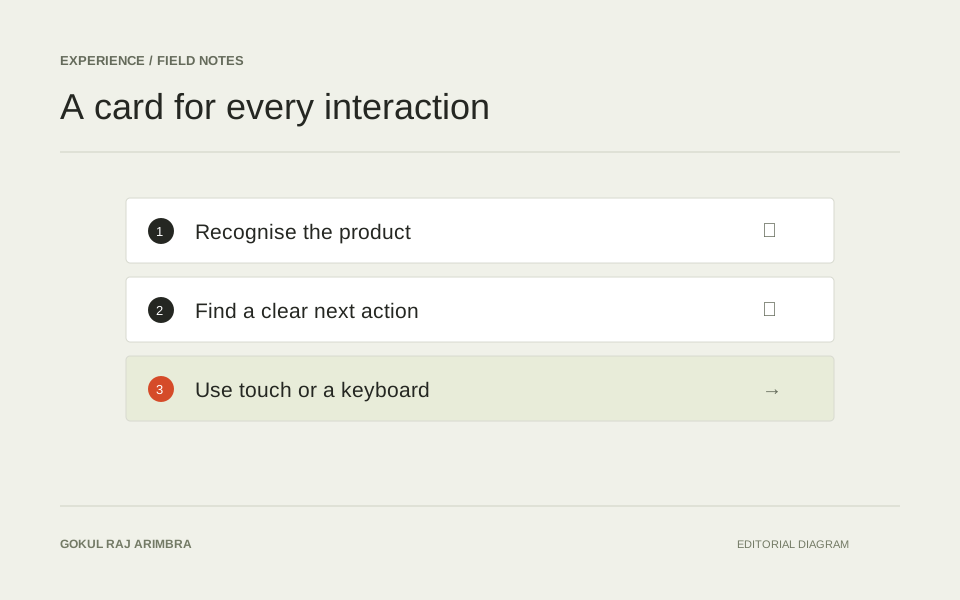
A product card has several jobs in a small space. It helps someone recognise an item, compare it with nearby alternatives and choose a next step. That makes it a useful place to examine how visual design and accessibility support the same decision.
Start with a real, varied set of products. A card that only works with a short name and a square photograph is a template demonstration, not yet a dependable part of a catalogue.
Decide what the main action is
Usually the product name and image lead to a detail page. Additional controls might save the item, choose an option or add it to a basket. Make their purposes distinct and avoid placing one interactive control inside another.
Try reading the card without its visual layout. The name, essential distinguishing attributes, price state and available actions should still form a useful sequence. Repeating “View product” on every link can make a list harder to navigate than using the product's actual name.
Make the photograph support recognition
Show enough of the product to understand it. A crop that suits a promotional banner may remove the ports, silhouette or packaging details someone needs when comparing products. Use a consistent image area while allowing the full subject to remain visible.
Decide the text alternative from the image's purpose. W3C's guidance explains that informative images need an alternative conveying their relevant meaning; the decision depends on how the image is used in the page. A linked product image beside the same linked product name may need different treatment from a photograph that shows a unique condition detail. W3C's informative image guidance
Keep controls understandable without hover
Do not make essential information available only when a mouse enters the card. Touch users need to see the next action, and keyboard users need a visible indication of focus. If a favourite control uses an icon, its accessible name should describe what it does and its state should be clear.
Test the sequence with Tab, Enter and Space where appropriate. Check that moving focus does not unexpectedly open a preview or shift the surrounding grid. A small, stable interaction is easier to use than a card that changes shape every time it receives attention.
Design the less convenient states
A price may be unavailable. An option may be required before purchase. A product may be temporarily out of stock. Give these states explicit language and a suitable action rather than leaving the usual button present but unresponsive.
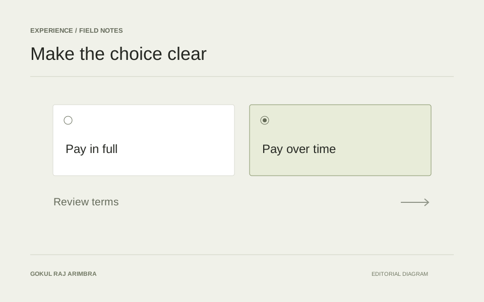
For selectable options, use controls with correctly associated labels. W3C's form guidance describes how labels communicate purpose to both people and assistive technology. That applies to a compact colour or capacity selector just as it does to a large form. W3C's guidance on labelling controls
Test the card as part of a collection
Finally, review a whole page of cards. Long names, mixed image proportions and different stock states should remain comparable without forcing identical content lengths.
The goal is a collection that someone can scan, understand and operate in the way that suits them. Visual polish becomes more convincing when every state supports that same level of care.