Experience / Field note
Payment choices need clear, consistent presentation
Different payment options add another decision to a checkout.
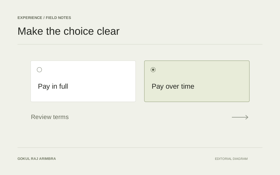
Different payment options add another decision to a checkout. The interface should help a visitor understand the available paths without letting promotional styling overwhelm the information they need.
Keep the choice understandable
Use consistent spacing and clear labels for each option. A selected state should be visible without relying on colour alone. Keep provider explanations accessible near the choice and avoid introducing important information only after a visitor has committed to the next step.
Review the handoff
Some journeys continue with another provider. Explain that transition and preserve the context needed to return. Consider what the customer sees after cancelling, encountering an error or returning with an incomplete process.
Treat clarity as the objective
Review the experience with a narrow screen and a keyboard. Make sure the selected option, its explanation and the main action remain connected in the layout. Any provider-specific terms should come from the responsible provider. The website's design should make those terms accessible without paraphrasing them into promises of its own.