Experience / Field note
The quiet details of a good interaction.
Focus, feedback and motion: small decisions that make a digital experience feel considered.
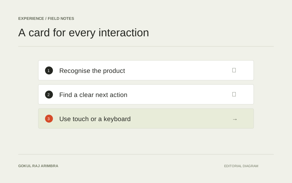
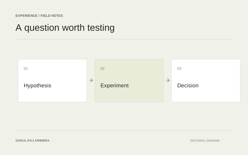
An interaction begins before a click and continues after it. The shape of a control suggests what it does. Its response confirms what happened. Its next state helps someone continue.
These details rarely need to be loud.
Make the current state clear
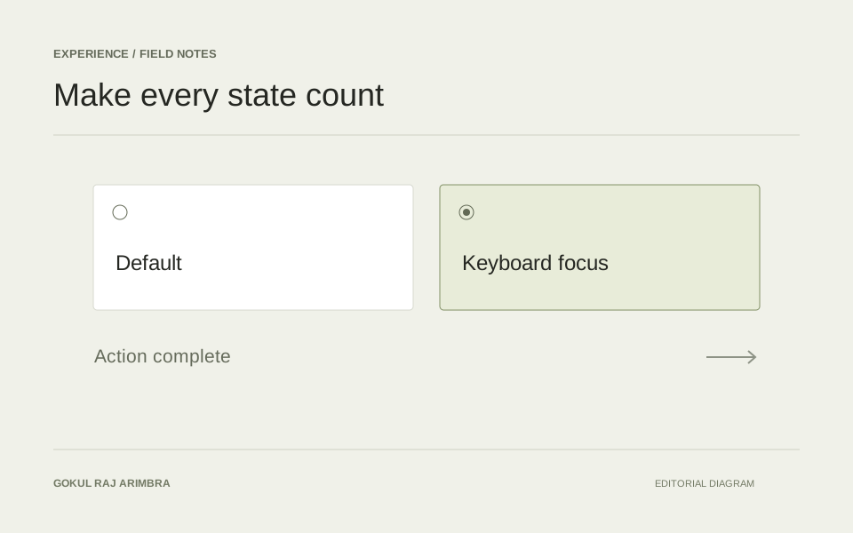
A selected filter, an open menu and a submitted form each need an understandable state. Colour can help, but a label, icon or structural change can make the meaning clearer.
Feedback works best when it arrives close to the action that caused it.
Remember the keyboard
The interface should remain understandable when the pointer disappears. Visible focus, a sensible order and controls that respond to the keyboard are fundamental parts of that experience.
The MDN guide to keyboard accessibility is a useful reference for the underlying principles.
Give motion a purpose
Motion can connect a control to a result, explain a change of state or guide attention. Its timing and distance should suit that job.
A short transition often says enough. Where motion is decorative, a pause control and a reduced-motion alternative let the experience adapt to the person using it.
Make touch feel intentional
Hover can add a layer of detail, but the important information should already be available. A touch interaction needs a clear target and a response that does not depend on keeping a pointer in one place.
The result should feel steady, understandable and easy to continue.