Design / Field note
Choose case-study images that explain the work
Real screenshots, complete interfaces and precise captions make a stronger project story than decorative imagery alone.
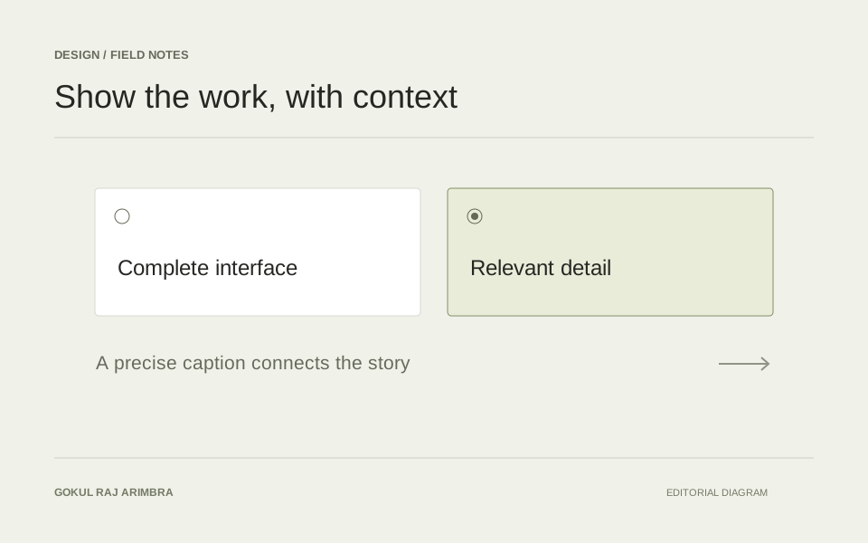
A case-study image should answer a question about the project. What did the interface look like? How did the product journey work? What changed between the initial problem and the proposed solution? When an image has a clear job, the surrounding story becomes easier to assess.
Attractive decoration can establish a mood, but it cannot stand in for evidence of a website or tool. Keep those roles distinct when choosing the visual material for a portfolio.
Start with the claim beside the image
Read the paragraph that the image will support. If it discusses catalogue navigation, show the relevant navigation and results. If it explains a mobile enquiry flow, include the form states that make the sequence understandable.
A homepage screenshot can introduce a project, but it cannot demonstrate every feature in it. Choose a small set of images with different purposes instead of repeating the same attractive banner in several device frames.
Preserve enough context to understand the screen
A tight crop may remove the controls that explain what someone is looking at. Keep the page title, relevant navigation and nearby information when those elements establish the meaning of the interface. For detailed inspection, provide a separate close view rather than replacing every complete screenshot with a fragment.
Distinguish a viewport capture from a complete-page capture. The first represents one screen at a particular size; the second shows the page's full structure. Both can be useful, but the caption should make the difference clear.
Capture the real state deliberately
Use the actual interface whenever it is available. Record the source URL, date and viewport so the image can be refreshed or explained later. If the site has changed since the work was completed, label a historical capture accordingly.
Do not quietly substitute an unrelated live website for an unavailable project. An honest archive image is more useful than a current screenshot that depicts someone else's work. The same principle applies to concept interfaces: describe them as concepts or demonstrations instead of presenting them as deployed client software.
Write captions that add information
A useful caption tells the reader why the image is present. “Mobile collection view showing active filters and the result count” is more informative than repeating the project name. Avoid suggesting that a screenshot proves an outcome that would require separate evidence.
Image alternatives also depend on purpose. W3C recommends expressing the relevant meaning of an informative image in its text alternative. For a complex interface, a concise alternative and nearby explanation can work together, with the article carrying the detail that would be unwieldy in an image description. W3C's informative image tutorial
Review the images at the size people will see
Inspect the finished page on desktop and mobile. Text inside a large screenshot may become unreadable in a small card, while a portrait capture may need a different frame from a wide desktop page. Preserve the complete image where that context matters and offer access to the original when closer inspection is useful.
The strongest visual story does not need an image for every paragraph. It needs the right images, shown clearly, with enough context to explain what the work actually involved.