Design / Field note
A design system should leave room for change.
On reusable parts, deliberate boundaries and systems that remain understandable as they grow.
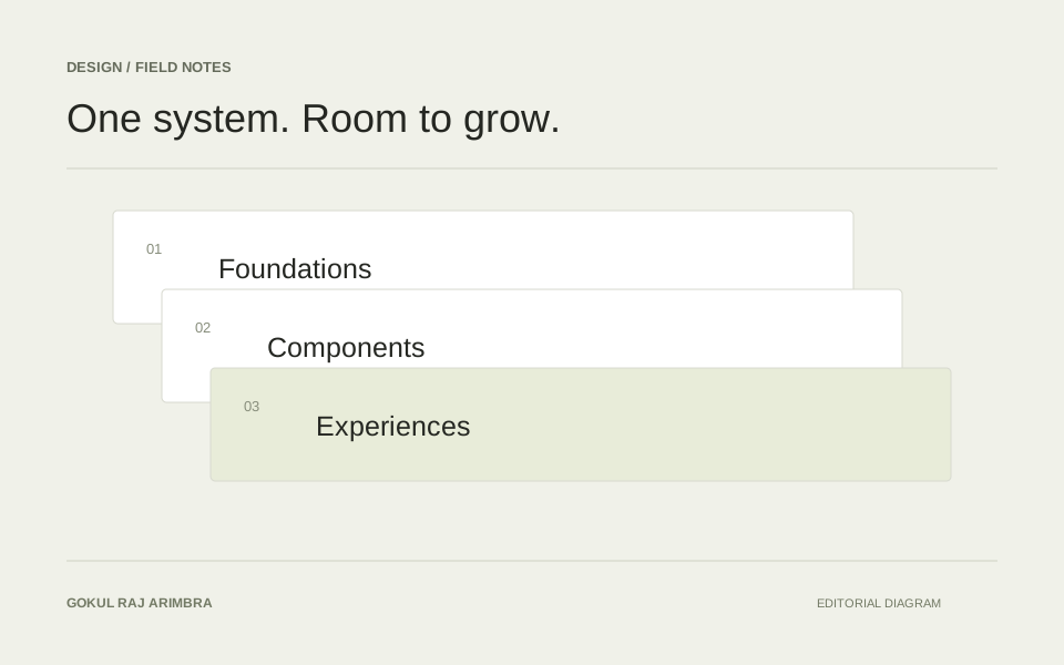
A design system is useful when it makes the next decision easier. A colour token or a reusable component earns its place by making an interface more understandable to build and to use.
The challenge is finding the right amount of structure.
Reuse the decision
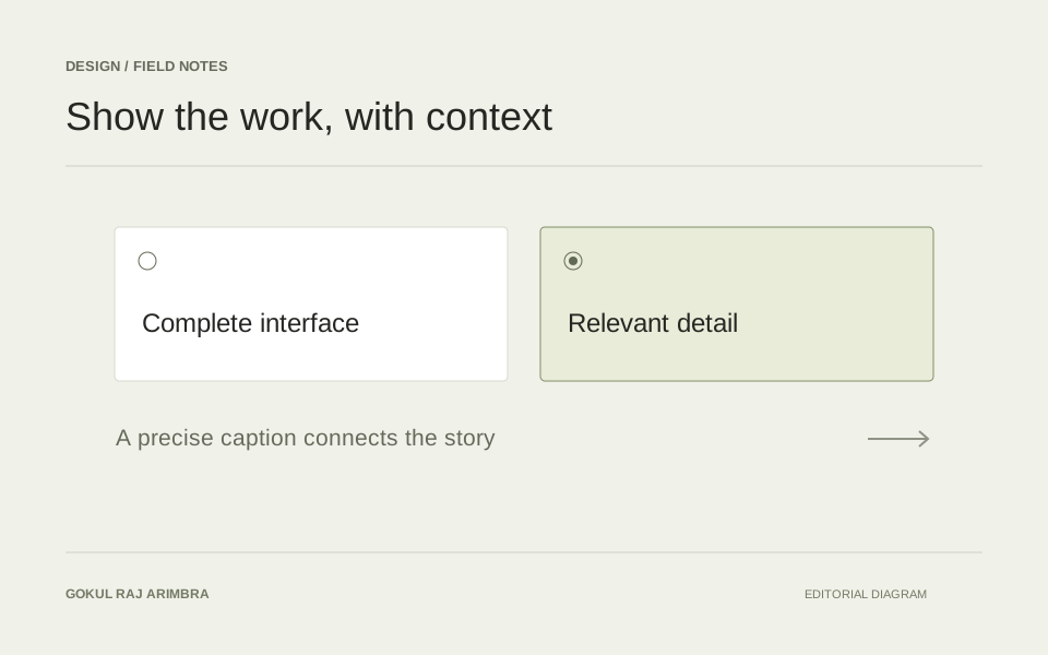
Two panels can look similar while solving different problems. Before making them one component, it helps to understand which decisions they actually share.
Spacing, type hierarchy and interaction states are often stable foundations. The exact content arrangement may deserve more freedom.
Make boundaries visible
A component becomes easier to change when its responsibility is clear. A navigation item needs to express a destination and its current state. A field needs a label, an input and useful feedback.
Giving each part a specific job makes it easier to see what belongs there and what does not.
Let content test the system
Short, perfectly balanced copy is a gentle test. Long headings, unfamiliar names, missing images and translated text reveal much more.
I like a system that bends around content instead of requiring every piece of content to fit a narrow ideal.
Keep the small screen in the conversation
Responsive design changes relationships, not just widths. A supporting column might become a following section. A row of controls might wrap. The reading order still needs to make sense.
A good system provides a few reliable rules, then leaves space for the context of the page.