Search / Field note
Search begins before the search box.
Why useful labels, clear categories and thoughtful empty states belong to the same conversation.
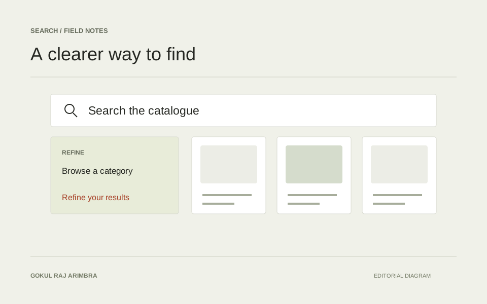
A search box is only one way into a collection. The words around it, the categories beside it and the structure of a results page all influence whether someone can find their way.
That makes search a question of information design as much as interface design.
Start with the language
A useful label is usually a familiar one. Internal names and clever category titles can make sense to the person who organised the content while leaving everyone else to guess.
I find it useful to read navigation labels without the surrounding page. Each should still suggest what sits behind it.
Give refinement a clear shape
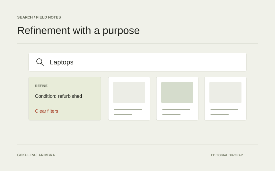
Filters should explain the choices that matter in the current context. Group related options, show what is selected and make clearing a choice straightforward.
On a smaller screen, that same structure needs to survive the move into a panel or drawer. A compact presentation should still make the current state easy to understand.
Plan for the unhelpful result
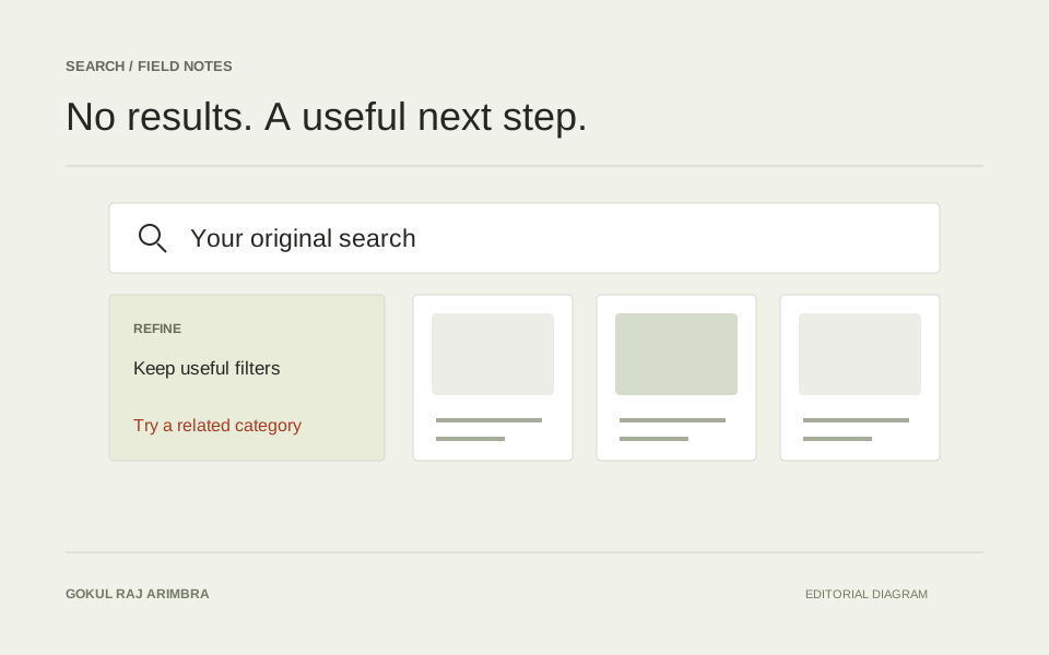
An empty result page is part of the experience. It can preserve the original query, show the active filters and provide a useful next step.
The same care applies while results load. Keeping the surrounding interface steady helps the person stay oriented.
Keep the journey connected
Search, browsing and product or content detail are connected parts of one journey. Consistent language and predictable navigation make moving between them feel natural.
The aim is simple: less guessing, a clearer next step, and an interface that keeps enough context in view.